This week we saw the S&P 500 hit another all-time high, but when you look under the hood, only 5-6% of the stocks in that index are actually making new highs themselves. The whole rally is being carried by a handful of mega-cap names while 90-95% of stocks are just sitting there.
It's a pretty remarkable situation when you think about it. The index looks great on paper, but the underlying breadth tells a completely different story. And it raises an interesting question: if the broad economy is showing signs of struggles, how sustainable is this concentrated rally in tech stocks that depend on this same economy as customers?
Don't get me wrong – this could absolutely keep working. Markets can stay disconnected from fundamentals longer than seems reasonable. But the data is flashing some signals that seem worth paying attention to, especially when you consider that with all this year's volatility, the market is barely up 5% YTD – roughly in line with what you can get from short-term U.S. Treasury yields with no risk.
The Math Behind Market Leadership
When you buy an S&P 500 index fund, you think you're buying "the stock market." But because of how these indexes work, you're really buying a concentrated bet on the biggest companies, and right now those biggest companies happen to be very expensive tech stocks riding the AI wave.
Microsoft, Apple, Nvidia, Google, Amazon—these companies have gotten so large that they can single-handedly move the entire index higher even when everything else is flat or declining. The current setup means 22 times earnings for the overall market is being driven by just 5-6% of stocks actually making new highs.
This isn't necessarily problematic, but it does create a hidden risk profile that most investors probably don't realize they own.
Economic Data: Yellow Flags, Not Red Ones
Let me start with the May economic statistics for the United States (I'll save you the trouble of reading through the Bureau of Economic Analysis). The numbers are painting a picture that doesn't quite match the market's AI optimism.
The May data showed broad-based softness:
• New home sales: -13.7%
• Housing starts: -9.8%
• Goods exports: -4.9%
• Building permits: -2.0%
• Retail sales: -0.9%
• Real consumer spending: -0.3%
• Industrial production: -0.2%
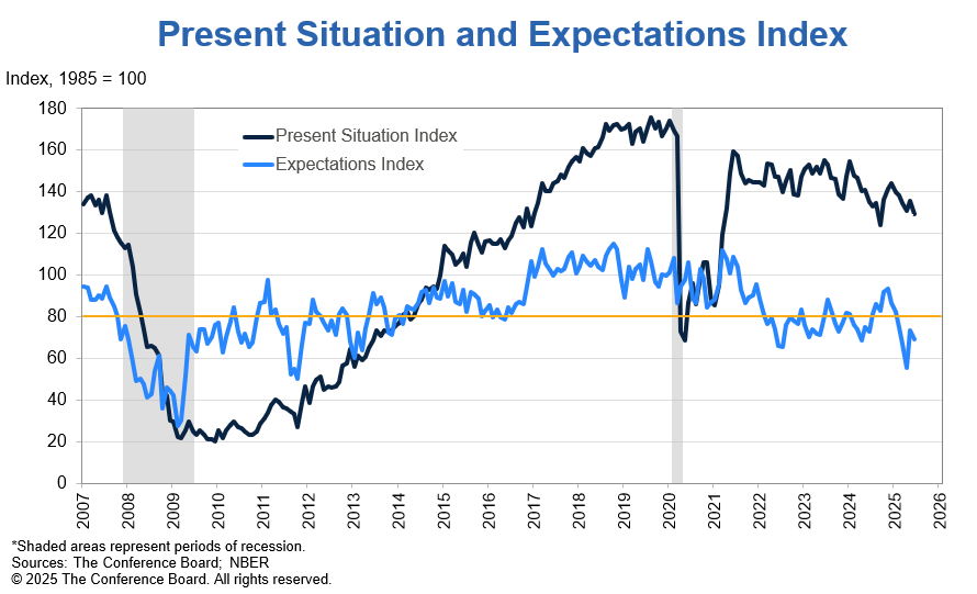
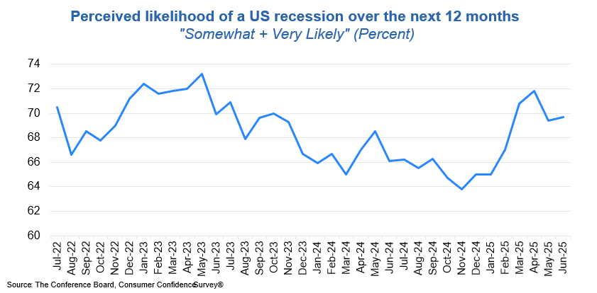
Now, one month doesn't make a trend, and these numbers could easily reverse. But combined with continuing unemployment claims trending upward and consumer confidence expectations hitting new lows near COVID levels, it suggests the economic foundation supporting tech companies' customers might be softening.
The key question I keep asking myself:
If businesses are cutting costs and consumers are pulling back spending, who exactly is driving the revenue growth that justifies current tech valuations?
I don't have the answer – if you do please let me know. Maybe AI creates entirely new demand streams that overcome these headwinds. But it's worth considering the possibility that even the best companies struggle when their customer base is under pressure. Whether a recession comes or not, the US consumer is anticipating one. This could cut their spending and manifest the very recession they are predicting.
The Housing Disconnect
Here's something that doesn't get much attention but probably should: US homes for sale are back to 2006-2007 peak levels, yet prices haven't adjusted downward.
Existing home sales are basically dead while median prices keep reaching new highs. You can't sell your house because nobody can afford to buy it at these prices.
This matters because a lot of US consumer spending—especially from the top 20%—comes from people feeling wealthy due to rising house values. But when housing starts are down 9.8% and transaction volume collapses, that wealth effect starts looking less reliable.
Again, this doesn't mean immediate collapse. But it does suggest one pillar of the current spending pattern may be shakier than it appears.
The Debt Reality Check
Let me give you some numbers that put the current US fiscal situation in perspective. Take a moment to compare the numbers between the two columns – see what a staggering difference 20 years has made.
| Metric | November 2004 | June 2024 |
|---|---|---|
| Total US Federal debt | $7.6T | $37T |
| US Debt/GDP | 60% | 121% |
| US Deficit/GDP | 3.3% | 7% |
| Fed Balance Sheet | $790B | $6.7T |
| Highest CPI in prior 10 years | 3.7% | 9% |
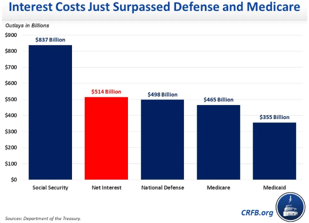
Interest expense now consumes 20% of federal receipts—more than defense spending. Among major developed countries, the U.S. runs the largest deficit at 7% of GDP.
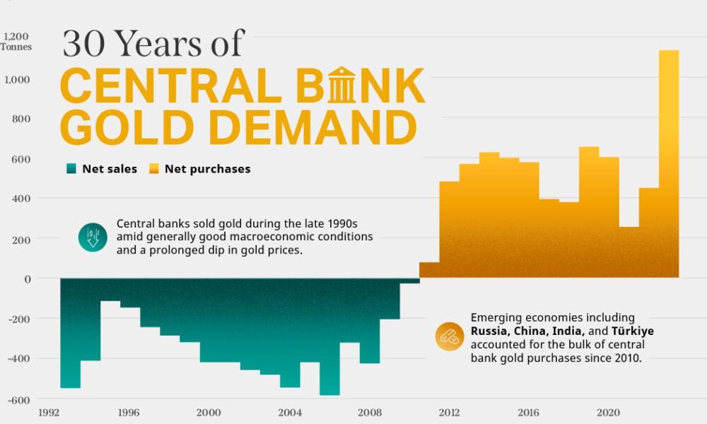
This doesn't create immediate problems for markets, but it does raise questions about long-term sustainability—especially when foreign central banks are reducing Treasury holdings and buying gold instead. When your customers start diversifying away from your product, it's usually worth noting.
The Unstoppable Debt Train
Every single President since 1980 has increased the US national debt—this isn't political commentary, it's mathematical fact.
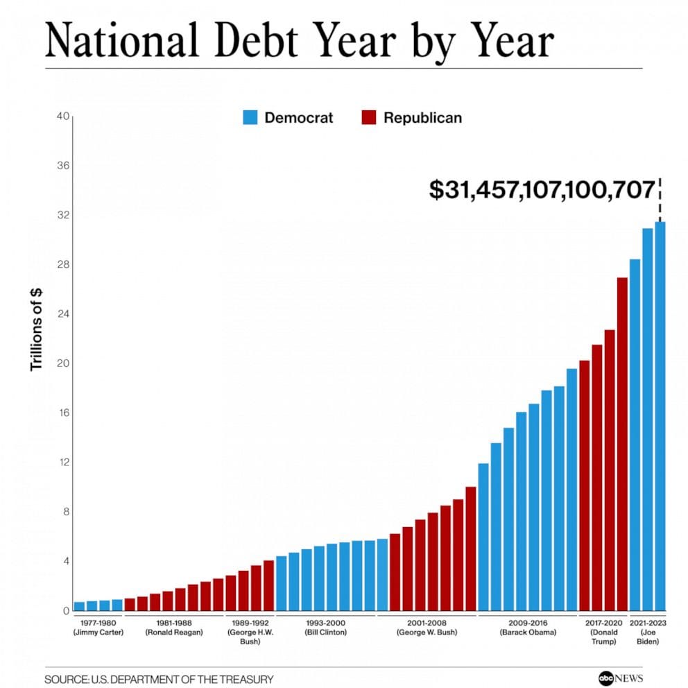
Whether you look at Reagan's defense buildup, Clinton's economic expansion, Bush's wars, Obama's financial crisis response, Trump's tax cuts, Biden's pandemic spending, and now Trump's big beautiful bill, the debt train never stops or even slows down. The chart tells the story: red bars, blue bars, it doesn't matter—they all point in the same direction.
Politicians campaign on fiscal responsibility, but the structural incentives of the system make debt reduction nearly impossible. Cutting spending means angry voters, raising taxes means angry donors, and borrowing money means the problems get kicked to the next administration. It's become a bipartisan tradition where both parties blame each other while participating in the same unsustainable trajectory.
The United States government debt has gone from $7.6 trillion in 2004 to $37 trillion today, and there's no evidence that either party has any real intention or ability to change course. At this point, it's less about politics and more about basic math—when interest payments alone consume 20% of federal receipts, the system has its own momentum that transcends whoever happens to be in the White House.
To put the scale of a $37 trillion debt in perspective, consider this instead:
- If you went back in time 1 million seconds, you'd only go back about 12 days.
- Go back 1 billion seconds, and you'd land in 1993.
- Go back 1 trillion seconds, you'd end up in the Stone Age about 31,700 years ago—over 31,000 years before the pyramids were built.
- And if you went back 37 trillion seconds—one second for every dollar of debt—you'd land in the early Pleistocene epoch, well before modern humans (Homo Sapiens) even existed. You'd be roaming the Earth with one of our early ancestors, Homo Erectus.

We're not just talking about big numbers here; we're talking about amounts of money that stretch beyond human comprehension.
What Smart Money Is Doing
Warren Buffett's Berkshire Hathaway currently holds 27% of assets in Treasury securities—among the highest levels in years. Meanwhile, Bank of America's Fund Manager survey shows institutional investors holding just 4.2% cash, a 25-year low.
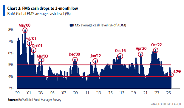
The contrast is notable: the most successful long-term investor can't find attractively priced assets, while professional managers feel compelled to stay fully invested in whatever's working.
This creates potential volatility when everyone who needs to sell has no cash buffer—their only option becomes selling existing holdings to raise liquidity.
The Risk-Reward Calculation
Here's what makes the current setup interesting from a risk perspective: with all this year's volatility and excitement, the market is up roughly 5% YTD. Meanwhile, short-term Treasury yields offer around 4.3% with no equity risk.
Is that 0.7% premium really worth the concentration risk in expensive tech stocks when economic data is sending mixed signals?
This doesn't mean avoiding markets entirely. But it does suggest the risk-reward equation has shifted enough to warrant defensive positioning—whether that's maintaining cash buffers, diversifying beyond index concentration, or simply acknowledging the risks inherent in current valuations.
Looking Ahead
The current market structure could persist much longer than seems reasonable—momentum has a way of continuing past logical endpoints. But when only 5% of stocks drive index performance while economic fundamentals show early warning signs, it's worth considering hedges.
There are silent rallies occurring in overlooked sectors that many investors don't recognize. Energy infrastructure, defensive dividend-paying companies, and other cash-generating businesses offer alternatives to the concentrated growth story driving current performance.
The question isn't whether to abandon markets, but whether to position more defensively when the data suggests the foundation supporting current leaders may be softer than it appears.
I'll be dedicating more digital ink to these alternative opportunities in future articles, as I start to reposition my portfolio. Sometimes the best investment insight is simply recognizing when you're watching a narrow rally masquerading as broad market strength—and positioning accordingly.
For now, maintaining liquidity buffers and exploring opportunities in less frothy sectors seems like prudent portfolio management when the magnificent few are carrying such a heavy load for the entire market.